Market Breadth Divergences: When the Index Lies and Stocks Tell the Truth
A market breadth divergence occurs when a major index like the Nasdaq 100 prints new highs, but fewer and fewer stocks are actually participating in the rally. The advance-decline line, percent of stocks above their 200-day moving average, and new highs versus new lows all tell the same story: the index is lying about the health of the market. In my experience, these divergences are among the most reliable early warnings that a trend is running on fumes.
Risk Disclaimer: Trading futures and other financial instruments involves significant risk of loss. Past results are not indicative of future performance. Only trade with capital you can afford to lose.
Why Breadth Matters More Than Price
Most traders watch the NQ futures chart and assume that when the index goes up, the market is healthy. That assumption is dangerously wrong. The Nasdaq 100 is cap-weighted, meaning the top 7 stocks (NVDA, AAPL, MSFT, AMZN, GOOG, META, TSLA) account for roughly 45% of the entire index. If those 7 rally hard while the other 93 decline, the NQ can still print a green day. It can even make new all-time highs.
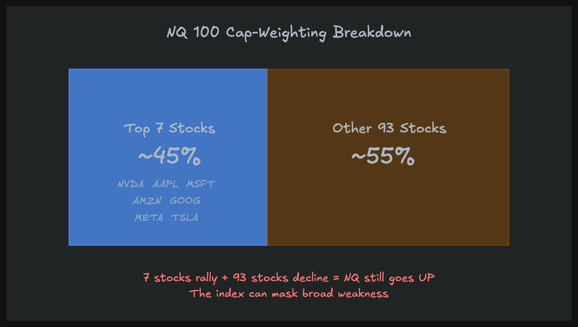
This is exactly what we saw through 2025 and into early 2026. The NQ pushed to record levels driven almost entirely by mega-cap AI plays, while the average Nasdaq 100 component was going nowhere or declining. On any given day, you might see the NQ up 1% while 60 of its 100 components closed red. That is not a healthy market. That is a market where a handful of stocks are masking broad weakness.
Think of it as effort versus result applied at the market level. The result (index at new highs) looks impressive, but the effort (the number of stocks contributing to that result) keeps shrinking. When I see this kind of setup, I immediately start thinking about reduced position sizes and faster profit-taking.
How to Measure Market Breadth
There are several breadth indicators, each with a slightly different lens on the same underlying question: how many stocks are participating?
Advance-Decline Line (A/D Line): The cumulative sum of advancing stocks minus declining stocks. When more stocks advance than decline, the A/D line rises. When the index makes a new high but the A/D line does not, you have a breadth divergence. This is the single most important breadth tool for swing traders.
New Highs vs. New Lows: Counts how many stocks are hitting 52-week highs versus 52-week lows. In a healthy uptrend, new highs should expand. When the index pushes higher but new highs contract, the rally is narrowing.
Percent Above 200-Day Moving Average: Shows what percentage of stocks in an index are trading above their long-term trend. A reading above 60-70% is healthy. Below 40% while the index is at highs signals a serious problem.
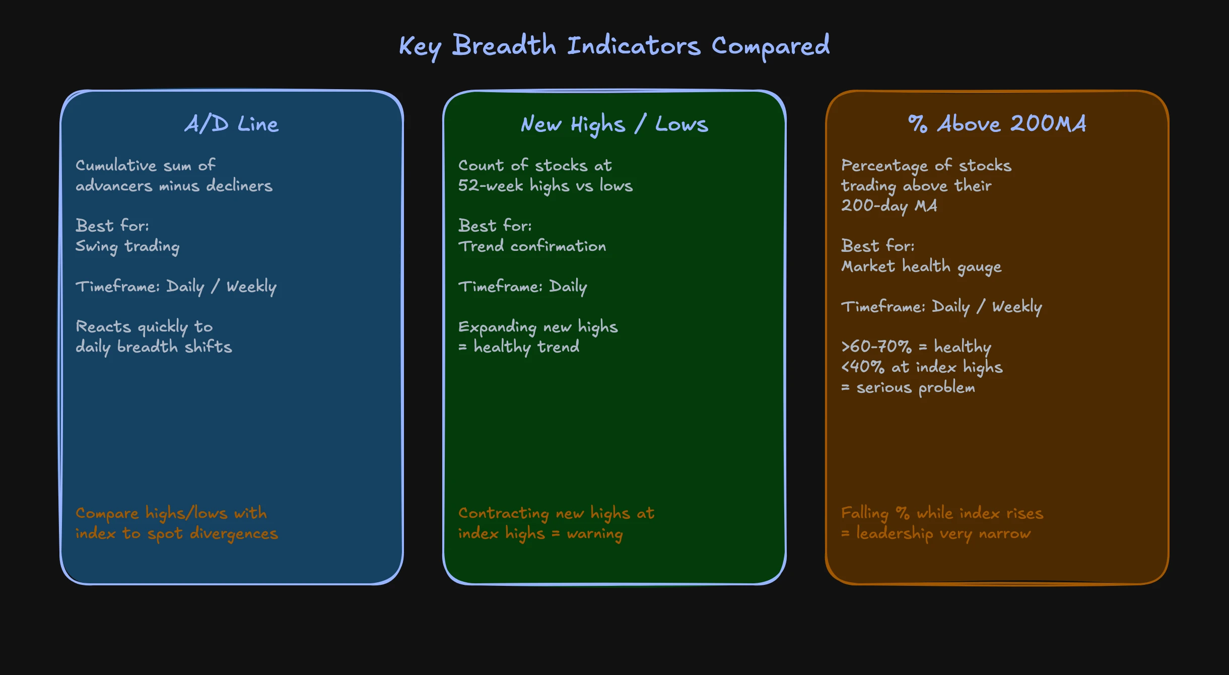
Each of these measures tells a slightly different part of the story, but when two or three of them diverge from price simultaneously, pay attention. That convergence of breadth weakness is far more significant than any single indicator flashing a warning.
Spotting the Divergence in Practice
The classic breadth divergence setup looks like this: the NQ (or S&P 500) pushes to a new swing high or all-time high, but the A/D line prints a lower high. The index says "new high," the breadth says "actually, fewer stocks agree this time."
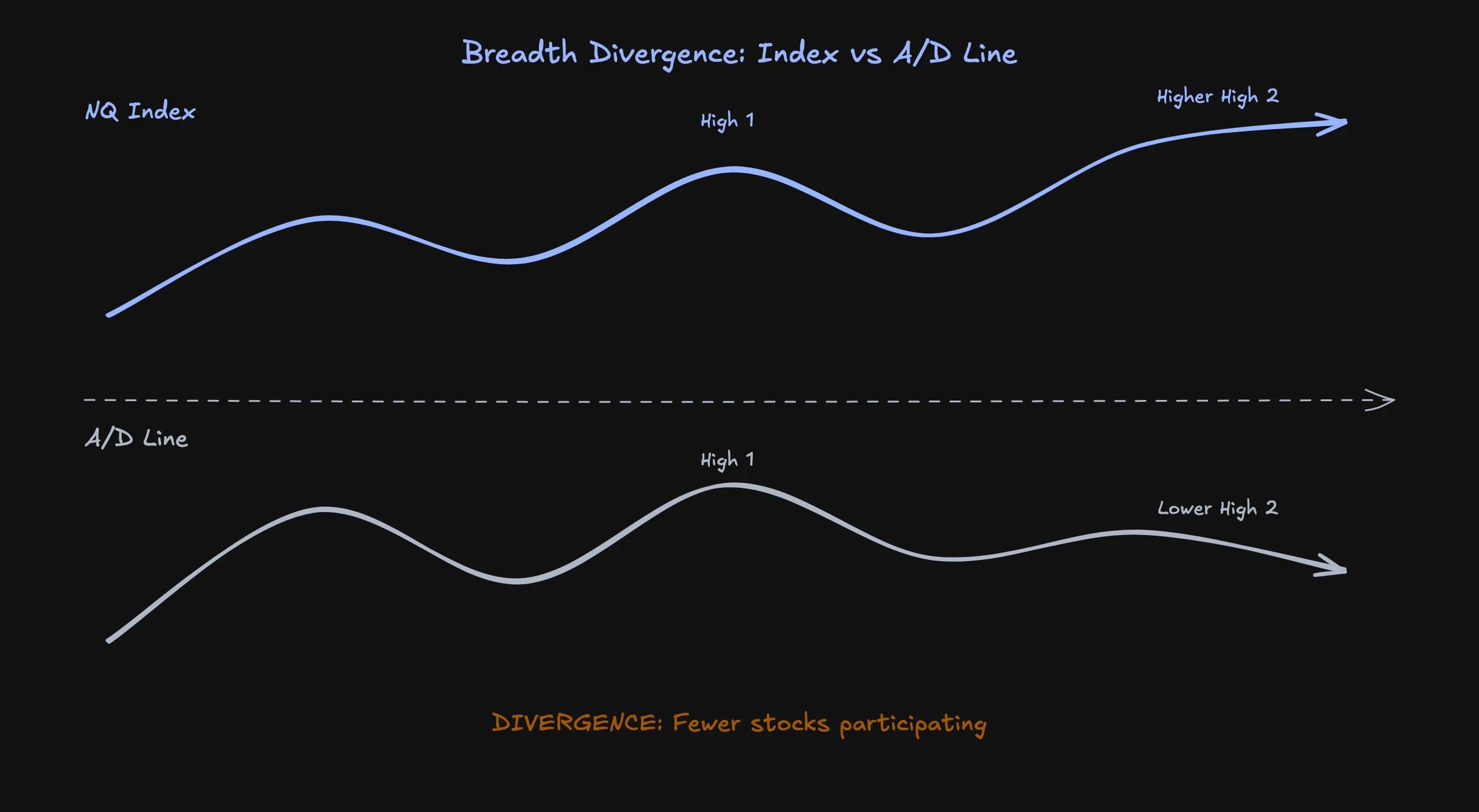
This pattern preceded the 2022 bear market almost perfectly. Through late 2021, the NQ kept grinding to new highs while the A/D line rolled over. By November 2021, the divergence was screaming. The equal-weight Nasdaq was already in a clear downtrend while the cap-weighted index was printing records. What followed was a 35% drawdown.
I am not saying that every breadth divergence leads to a crash. Sometimes the divergence resolves bullishly, with lagging stocks catching up to the leaders. But when you combine a persistent breadth divergence with extreme valuations (like CAPE ratios near dot-com levels, which is where we sit in 2026), the risk-reward shifts meaningfully.
For swing traders, the A/D line is the primary tool. Plot it alongside the NQ daily chart and compare the highs. If price makes a higher high and the A/D line makes a lower high, mark it. Two or three of these divergences in sequence is a pattern you cannot ignore.
Intraday Breadth: The ADD
For intraday futures trading, the daily A/D line updates too slowly. Instead, I watch the NYSE Advance-Decline Difference (ADD, ticker $ADD on most platforms). This shows the real-time difference between advancing and declining stocks on the NYSE throughout the trading day.
The ADD gives you an intraday read on whether the broad market supports what the index is doing. If the NQ rips higher in the morning but the ADD is flat or negative, that rally is suspect. It is being driven by a few names, not broad buying. Conversely, if the NQ is pulling back but the ADD holds firmly positive, the selling pressure is probably concentrated in a few large names and the broader market is still healthy.
I use the ADD as a confirmation filter, not a primary signal. If my chart setup says long but the ADD is deeply negative and declining, I pass on the trade or reduce size. If my setup says long and the ADD confirms broad strength, I take the trade with full conviction.
The 2026 Setup: Concentrated Leadership and Elevated Valuations
As of early 2026, we are dealing with one of the most concentrated leadership environments in market history. The Shiller CAPE ratio for the S&P 500 sits near levels last seen during the dot-com bubble. The NQ's cap-weighting has become even more extreme as AI-related mega-caps have continued to dominate.
This does not mean a crash is imminent. Markets can stay concentrated and expensive for longer than most traders expect. But it does mean that when the eventual rotation or correction comes, cap-weighted indices will understate how much damage has already been done to most stocks.
My approach in this environment is straightforward: trade smaller, take profits faster, and respect breadth divergences when they appear. If I see the NQ making new highs while the A/D line is rolling over and the percent of stocks above their 200MA is declining, I am not fighting that signal by pressing longs.
Understanding breadth also connects directly to the macro environment. Interest rate cycles, liquidity conditions, and economic data all influence whether breadth expands or contracts. A Fed tightening cycle tends to narrow breadth as weaker companies lose access to cheap capital, while easing cycles tend to broaden participation.
For a deeper look at how these dynamics play out in NQ specifically, see my guide on Nasdaq futures trading. And for the full framework on using internals in your trading, start with the Market Internals pillar article.
FAQ
What is the difference between market breadth and market depth?
Market breadth measures how many stocks participate in a move (advancing vs. declining). Market depth refers to the order book, specifically how much liquidity sits at various price levels. They are completely different concepts, though both matter for understanding market health.
Can breadth divergences last for months before a correction?
Yes. The 2021 divergence built for several months before the NQ finally rolled over in early 2022. Breadth divergences are not timing tools. They tell you the market is getting fragile, not that it will reverse tomorrow. Use them to adjust risk, not to pick tops.
Which breadth indicator is best for day trading futures?
The NYSE Advance-Decline Difference ($ADD) is the most practical for intraday trading. It updates in real time and gives you a read on whether broad market participation supports or contradicts the index move you are trading.
In our macroeconomics course with 20 video lessons, you'll learn how bonds, interest rates, and economic data interact.