Delta and Cumulative Volume Delta (CVD): Advanced Order Flow Analysis
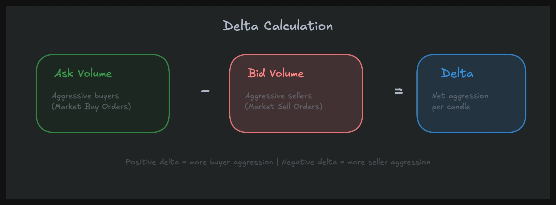
Delta in trading measures the difference between aggressive buying volume (trades executed at the ask) and aggressive selling volume (trades executed at the bid) within a given period. Cumulative volume delta (CVD) is the running total of that difference over time, forming a line that tracks the net aggression of market participants.
If you already understand the basics of order flow trading, delta and CVD are where you move from watching the market to actually reading it. These two metrics have been central to my trading for years, and I consider them some of the most misunderstood concepts in retail education.
Risk Disclaimer: Trading futures and other financial instruments involves significant risk of loss. Past results are not indicative of future performance. Only trade with capital you can afford to lose.
What Delta Really Measures (and Why Most Explanations Get It Wrong)
Aggressive vs. Passive: The Distinction That Matters
Most blog posts and YouTube videos will tell you delta shows "buyers vs. sellers." That framing is wrong, and it leads to wrong conclusions.
Every trade has a buyer and a seller. Always. When 500 contracts trade in ES at 4,520.00, someone bought 500 and someone sold 500. The volume is identical on both sides. Delta does not measure who "bought more." It measures who was the aggressor.
When a trader hits the ask price, they are lifting an offer. They are the aggressive buyer. They want in now and are willing to pay the spread to get filled. That transaction registers as positive delta. When a trader hits the bid, they are hitting a bid. They are the aggressive seller. That registers as negative delta.
What Passive Orders Hide
Here is what delta cannot show you: the passive side. The limit order sitting at the ask that got filled does not tell you whether that seller was initiating a new short, closing a long, hedging an options position, or executing an index arbitrage. The passive participant's intent is invisible.
This is not a flaw. It is the nature of the data. But it means you should never interpret positive delta as "more buyers than sellers." The correct reading is: "more participants chose to buy aggressively than to sell aggressively during this period."
When I traded at a prop desk, this distinction shaped every decision. A bar with +2,000 delta in NQ does not mean the market is bullish. It means 2,000 more contracts were traded at the ask than at the bid. What matters is what price did in response.
Why This Distinction Changes Your Analysis
Once you internalize that delta measures aggression, not conviction, your reads improve immediately. You stop looking at delta in isolation and start asking better questions: Was that aggression rewarded with price movement? Did price absorb it? Did it happen at a level that matters?
These questions lead directly to the two most powerful delta-based setups: divergence and absorption. Both require understanding delta as a measure of effort, not outcome.
The Three Ways to Read Delta
Per-Bar Delta
The simplest form. Each candle on your chart carries a delta value: the sum of ask volume minus bid volume for that bar's duration. A 5-minute candle in NQ might show +1,200 delta, meaning 1,200 more contracts traded at the ask than the bid during those five minutes.
Per-bar delta gives you a snapshot. It tells you who was more aggressive in that specific window. Green candles with negative delta or red candles with positive delta are immediate flags. They suggest the candle's direction and the underlying aggression do not agree, which is often an early signal of a turn.
I watch per-bar delta on every single candle. Not to make trades from it alone, but as a constant stream of context. It is the pulse of the market.
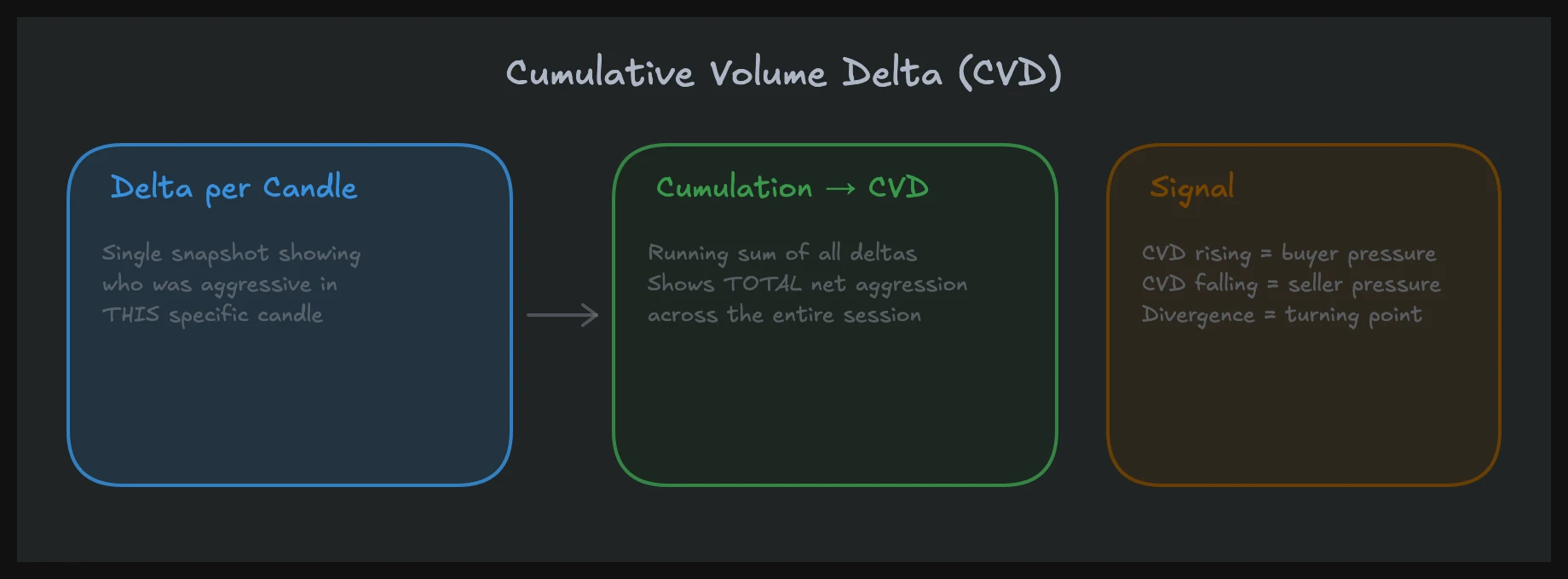
Cumulative Volume Delta (The CVD Line)
CVD takes every bar's delta and sums it into a running total, plotted as a continuous line. If bar one has +500 delta, bar two has -300, and bar three has +200, the CVD after three bars reads +400.
The CVD line functions like a momentum indicator, but it measures something different from RSI or MACD. It measures the cumulative aggression of market participants. When the CVD line is rising, aggressive buyers have been dominant over the measured period. When it is falling, aggressive sellers have had the upper hand.
The real power of CVD is not in its direction. It is in how its direction compares to price. This comparison is where divergence analysis begins, and it is one of the most reliable leading signals I use.
Delta by Price Level (Footprint View)
The third reading comes from footprint charts, where you can see delta at each individual price level within a bar. Instead of one delta number for the entire candle, you see the bid/ask split at every tick.
This granularity reveals where aggressive activity concentrated. A candle might show net +800 delta, but the footprint reveals that +1,500 of it came from a single price level near the low, while the upper half of the candle was net negative. That is a completely different story than evenly distributed buying.
Delta by price level is where absorption becomes visible. I will cover that in detail below, but for now, understand that the footprint view adds a spatial dimension to delta that the other two views lack.
Delta Divergence: The Leading Reversal Signal
What Divergence Looks Like
Delta divergence occurs when price and CVD disagree on direction. The classic bullish divergence: price makes a lower low, but CVD makes a higher low. Aggressive selling is declining even as price drops further. The sellers are running out of conviction.
The bearish version: price makes a higher high, but CVD makes a lower high. Buyers are pushing price up, but each push requires less aggressive buying, and the cumulative picture shows it. The buying is exhausting.
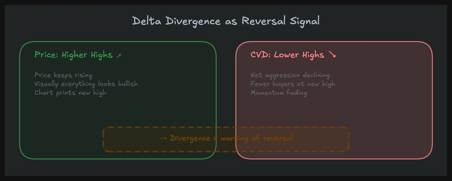
I see this pattern regularly in NQ during the first 90 minutes of the session. Price grinds higher, hits a new high of day, but CVD is flat or declining relative to the prior high. That disconnect often precedes a pullback within 15 to 30 minutes.
Why Divergence Works
Divergence works because it identifies when one side is losing participation while price still moves in their favor. Price can advance on low aggression for a while (passive sellers stepping away, for example), but eventually, markets need aggressive flow to sustain a move.
When price makes a higher high on declining aggressive buying, it means the move is being sustained by an absence of selling rather than a presence of buying. That is a fragile structure. The moment sellers return, there is no aggressive bid to defend the level.
This connects directly to auction market theory. Price explores in one direction until participation fades, then rotates. CVD divergence quantifies that fading participation before the rotation begins.
Practical Reading of Divergence
Do not treat every divergence as a trade signal. Context matters enormously. A CVD divergence at a significant volume profile level (like the prior day's point of control or value area boundary) carries far more weight than one in the middle of nowhere.
I also look at the timeframe. Divergence on a 1-minute chart is noise. Divergence developing over 30 to 60 minutes on a 5-minute chart, especially during a session where volume is decent, is a signal I take seriously. The more bars involved in the divergence, the more participation data underlies it.
One more filter: I want to see the divergence confirmed by a change in per-bar delta. If CVD is diverging bearishly and I start seeing individual bars print with negative delta on up candles, the signal strengthens. The confirmation does not need to be dramatic. Just consistent.
Effort vs. Result: Reading Absorption Through Delta
The Core Concept
This is the most actionable delta-based concept I use, and it is almost completely invisible on standard candle charts.
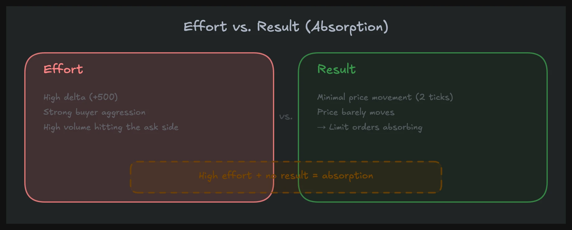
Effort vs. result asks a simple question: did the aggressive activity produce a proportional price move? If delta is strongly positive (+2,000 on a single 5-minute bar in NQ, for instance) but price barely moved, something absorbed that buying. Passive sellers ate the aggression without letting price advance.
That is absorption. It means there is a large passive participant willing to sell at that price, and they are big enough to absorb the aggressive flow without being moved. This is often institutional activity, and it tells you something that price alone never reveals.
How Absorption Appears on a Footprint
On a footprint chart, absorption shows as heavy ask volume at one or two price levels near the top of a candle, with little or no price progress above those levels. You see aggressive buyers hitting the ask repeatedly, contracts trading in size, but price stays pinned.
A concrete example: NQ is trading at 18,450. A 5-minute bar prints with +1,800 delta. But the high of the bar is only 18,454. Four ticks of upside from 1,800 contracts of net aggressive buying. On the footprint, you see 600 contracts traded at the ask at 18,452 alone, and price never sustained above it. Someone was selling into every buy. That is absorption.
On a standard candle chart, this bar might look like a small-bodied green candle. Nothing remarkable. On the footprint with delta data, it is a clear warning that buyers are being absorbed and the level is likely to hold.
Absorption vs. Exhaustion
It is important to distinguish absorption from exhaustion. Both involve high delta and low price movement, but the cause differs.
Absorption means a large passive counterparty is present. There is a wall of supply (or demand) that the aggressive side cannot push through. This often happens at institutional levels, VWAP, prior day high/low, or significant volume profile nodes.
Exhaustion means the aggressive side is running out of participants. Delta is positive but declining, volume is thinning, and price stalls because there is no one left to buy, not because someone is actively selling into it.
The distinction matters because absorption often leads to a reversal (the absorbing side tends to be the stronger participant), while exhaustion leads to a drift or a slow pullback. On the footprint, absorption shows concentrated volume at specific levels. Exhaustion shows declining volume across all levels.
Combining Delta with Volume Profile and Market Structure
Delta at High-Volume Nodes
Volume profile tells you where the most trading occurred. Delta tells you who was aggressive at those levels. The combination is powerful.
When price revisits a high-volume node from a prior session and you see strong negative delta (aggressive selling), it tells you that the participants who built that node are defending it. Sellers are stepping in where they traded before. That is confirmation that the level is active, not just historical.
Conversely, if price pulls back to a high-volume node and delta is muted (small, mixed), the level may not be defended. Prior participants may have already exited their positions, and the node is a relic rather than a barrier.
Delta at Value Area Boundaries
Value area high and value area low are natural inflection points. When price tests the value area high and delta turns negative, it often means the market is rejecting the premium. When price tests the value area low and delta turns positive, it suggests acceptance of value and potential rotation higher.
I combine these reads with tape reading for confirmation. If I see absorption on the footprint at the value area high and the tape shows large prints hitting the bid, the confluence is strong.
Delta in Trending vs. Ranging Markets
In a trending market, delta tends to align with price direction. Positive delta on up bars, negative delta on down bars, and the CVD line moves in the direction of the trend. This is a healthy trend. Aggression and price agree.
When a trend is about to stall, delta starts disagreeing. You see the divergences discussed earlier, or you see bars with delta that contradicts their direction. These are the first cracks.
In a range, delta oscillates, and CVD tends to flatten. The readings that matter in a range are absorption at the boundaries. If price pushes to the top of the range with strong positive delta and then reverses, that is different from pushing to the top with declining delta. The first suggests a possible breakout attempt that failed (absorption). The second suggests the market simply ran out of buyers (exhaustion).
Limitations and Common Mistakes
Low-Volume Environments
Delta data is only as reliable as the volume behind it. In NQ during the overnight session, a +300 delta bar might represent only a handful of participants. Reading that as "strong buying" would be a mistake. The same +300 delta during RTH (regular trading hours), when volume is 10x higher, carries real weight.
I largely ignore delta signals in low-volume environments. The pre-market in NQ futures between 4:00 AM and 8:00 AM ET can produce wild CVD swings that mean very little. Wait for volume to confirm that the participants behind the delta are the ones who move markets.
Over-Reliance on a Single Metric
Delta is a confirmation tool. It is not a standalone signal generator. I have seen traders build entire systems around CVD divergence without considering price structure, volume profile levels, or broader market context. Those systems fail because delta without context is just a number.
Use delta to confirm or deny what price structure suggests. If price is at a significant support level and delta shows absorption (passive buyers absorbing aggressive sellers), that confirms the level. Delta alone does not create the trade. The level creates the idea, and delta confirms or invalidates it.
Misreading Passive Activity
Remember: delta only shows you the aggressive side. A bar with zero delta does not mean nothing happened. It might mean aggressive buying and selling were perfectly balanced. Or it might mean all activity was passive (limit orders filling against each other at the midpoint). The data does not distinguish these scenarios.
This is why order book analysis complements delta. The order book shows you the passive side: where limit orders are stacked, where they are being pulled, where new liquidity appears. Delta shows you who crossed the spread. Together, they give you both halves of the picture.
Aggregation Period Sensitivity
The delta value changes depending on your bar size. A 1-minute bar might show -200 delta while the 5-minute bar it belongs to shows +800 delta. Neither is wrong. They measure different time windows.
I use 5-minute bars for CVD divergence analysis and 1-minute bars for real-time absorption detection. Mixing timeframes without being explicit about what each tells you leads to contradictory reads and bad decisions.
Building a Delta-Based Reading Workflow
Step 1: Establish Context First
Before looking at delta, know where price is relative to structure. Is it at a volume profile node? Near VWAP? At a prior session high or low? At the value area boundary? Delta readings only matter at levels that matter.
Step 2: Check CVD Trend vs. Price Trend
Is CVD confirming price direction, or diverging? Confirmation means the trend is healthy. Divergence means participation is shifting. This is your macro read for the session.
Step 3: Watch Per-Bar Delta for Anomalies
As price approaches your levels of interest, watch individual bar delta. Are up candles printing with negative delta? Are large delta bars failing to move price? These anomalies are the signals.
Step 4: Zoom into the Footprint for Precision
When you spot an anomaly, drop into the footprint chart to see where delta concentrated within the bar. This is where absorption becomes visible and where you can assess whether the signal is noise or genuine institutional activity.
Step 5: Confirm with Tape
The final filter is the tape. Are large prints hitting the bid or the ask? Is the size consistent with the delta reading, or is there a mismatch? The tape gives you real-time confirmation of what delta is showing you in aggregate.
This workflow is not fast. It requires practice and screen time. But it produces reads that candle charts alone simply cannot deliver.
Frequently Asked Questions
What is the difference between delta and cumulative volume delta (CVD)?
Delta is the per-bar difference between volume traded at the ask and volume traded at the bid. It resets each bar. CVD is the running sum of all delta values over time, forming a continuous line. Think of delta as a snapshot of aggression in one bar, and CVD as the trend of aggression across the session. Both measure aggressive participation, but CVD reveals the bigger picture of whether buyers or sellers have been dominant over a longer period.
Can I use CVD divergence as a standalone entry signal?
No. CVD divergence identifies when aggressive participation is fading, but it does not tell you when price will reverse or how far it will go. Divergence needs context: a significant price level, a structural setup, and ideally confirmation from per-bar delta or the tape. I use divergence as a filter, not a trigger. It tells me the conditions are right for a reversal, and then I look for the specific entry from price action at the level.
Does delta work the same way in stocks as in futures?
The concept is the same, but the data quality differs. Futures markets (ES, NQ, CL) trade on centralized exchanges where every transaction is recorded with accurate bid/ask attribution. Stocks trade across multiple exchanges and dark pools, so the delta data you see may not capture all activity. For delta analysis, futures are the cleanest instrument. If you trade stocks, treat delta readings as directional indicators rather than precise measurements.
How do I identify absorption without a footprint chart?
You can approximate absorption by watching for bars with high absolute delta but small bodies (low price movement). A 5-minute bar in NQ with +1,500 delta and only a 3-point range is a strong absorption candidate. However, the footprint chart gives you the spatial detail to confirm it: you can see exactly which price levels absorbed the flow. Without the footprint, you are inferring absorption rather than observing it directly.
What timeframe is best for CVD divergence analysis?
I use 5-minute charts for most CVD divergence analysis in NQ and ES. This timeframe captures enough data per bar to be meaningful while still being responsive enough to catch divergences as they develop. The 1-minute chart generates too many false divergences. The 15-minute chart is useful for longer-term session reads but often confirms a divergence only after much of the move has already happened. Start with 5-minute, and adjust based on the instrument's volatility and your trading style.
In our mentoring program, you'll learn these concepts in over 1,500 video lessons with real chart examples.